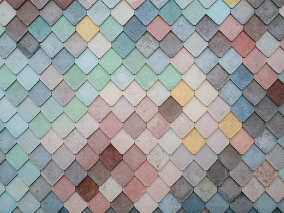
Choosing the right color palette for your home can transform any space, setting the tone and mood for your entire living environment. In The Ultimate Guide to Choosing the Perfect Color Palette for Your Home, we dive deep into the art and science of color selection. Whether you’re looking to create a cozy retreat, a vibrant social hub, or a calming sanctuary, this guide offers expert tips, practical advice, and creative ideas to help you find the perfect hues that reflect your style and personality. Get ready to turn your home into a cohesive, harmonious space that feels uniquely yours.
Getting Started: A Quick Dive into Color Theory
Before we jump into specific color palettes, it’s helpful to understand a bit about color theory. Don’t worry—this isn’t art class, just the basics to help you feel more confident in your choices.
Complementary Colors: These are colors that sit opposite each other on the color wheel, like blue and orange. Using them together creates a vibrant, high-contrast look that really pops.
Analogous Colors: These are neighbors on the color wheel—like blue, teal, and green. They work well together to create a harmonious, calming vibe.
Monochromatic Colors: This involves using different shades and tints of a single color. It’s a great way to create a cohesive, subtle look.
Triadic Colors: Triadic color schemes use three colors that are evenly spaced on the color wheel, like red, blue, and yellow. This approach offers balance with a bit of playful contrast.
Tips for Choosing Your Home Color Palette
Picking the right colors might feel overwhelming, but it’s really about what feels right for you. Here are some steps to guide you:
Think About How You Use the Room: Different rooms serve different purposes, so think about the mood you want to create. A bedroom might need calming tones, while a living room might be better suited to something more energetic.
Start with a Base Color: Choose a base color that will dominate the space. Neutrals like white, gray, or beige are popular choices because they’re versatile and easy to build on.
Add Accent Colors: Once you have your base color, it’s time to bring in one or two accent colors. These should complement your base and add some personality to the room.
Consider Natural Light: Lighting plays a huge role in how colors appear. For example, rooms with lots of natural light can handle cooler tones, while darker rooms might benefit from warmer shades.
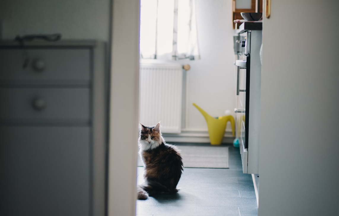
Test Your Colors: Before you commit, test your colors on small patches of your walls. Look at them at different times of day to see how they change with the light.
Color Palette Ideas for Every Room
Now that you have the basics, let’s get into some specific color palettes that work well for different spaces and vibes.
1. Cozy Retreat
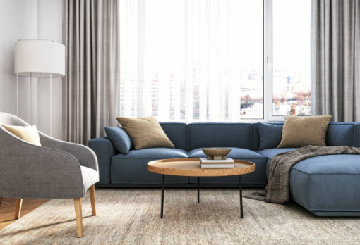
If you want a space that feels warm and inviting—like a bedroom or reading nook—go for soft, muted tones. Warm grays, taupes, and creamy whites paired with deep blues or rich burgundy create a comforting, cocoon-like atmosphere.
- Base Color: Soft Gray
- Accent Colors: Deep Blue, Warm Taupe
- Highlights: Creamy White
2. Vibrant Social Hub
For living rooms and dining areas where you want to encourage conversation and energy, bold, contrasting colors are your best friends. Think bright teals paired with mustard yellows and vibrant corals.
- Base Color: Neutral White or Light Gray
- Accent Colors: Mustard Yellow, Teal
- Highlights: Vibrant Coral
3. Calming Sanctuary
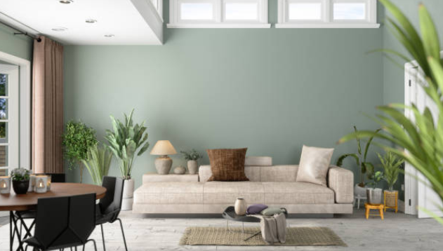
To create a peaceful oasis—whether it’s a bathroom or a meditation room—cool tones and natural hues work wonders. Soft greens, pale blues, and beiges create a serene environment.
- Base Color: Soft Green or Pale Blue
- Accent Colors: Beige, Light Gray
- Highlights: White or Pale Lavender
4. Minimalist Living
Minimalist spaces thrive on simplicity. Stick to neutral tones and add interest with subtle texture rather than color. Think of it as creating calm through simplicity.
- Base Color: White or Light Gray
- Accent Colors: Charcoal, Soft Beige
- Highlights: Light Wood Tones
5. Maximalist Living
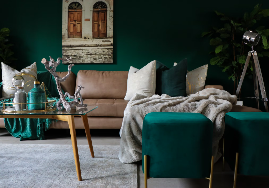
Maximalism is all about embracing bold colors and patterns. Mix and match vibrant colors to create a space full of personality—think jewel tones like emerald green, bright pink, and rich purples.
- Base Color: Deep Emerald Green
- Accent Colors: Bright Pink, Gold
- Highlights: Rich Purple, Teal
6. Child-Friendly
For children’s rooms, go for fun and playful colors that are cheerful without being overwhelming. Bright pastels work well here, offering a balance between energy and comfort.
- Base Color: Soft Yellow or Light Aqua
- Accent Colors: Coral, Sky Blue
- Highlights: Pastel Pink
7. Student Digs
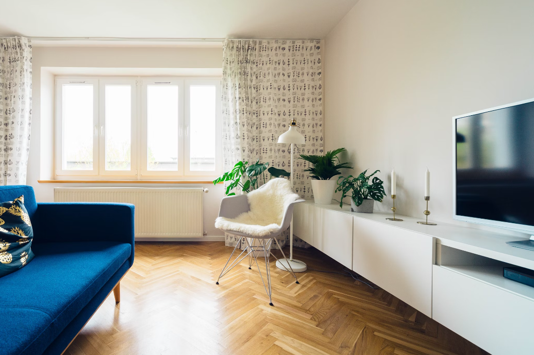
Student spaces should be practical and easy to change up but still reflect personality. A mix of neutrals with one or two bold colors can keep things lively without being distracting.
- Base Color: Light Gray or White
- Accent Colors: Navy Blue, Lime Green
- Highlights: Orange or Bright Red
8. Urban Retreat
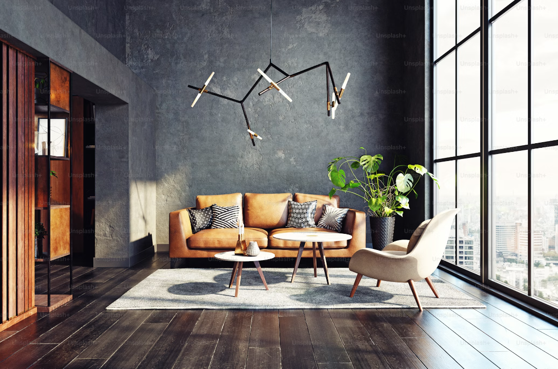
For a modern, urban vibe, go for a sophisticated, sleek look with darker tones and metallic accents. Charcoal, deep burgundy, and steel blue can give your space that city-chic feel.
- Base Color: Charcoal or Dark Gray
- Accent Colors: Metallic Gold, Deep Burgundy
- Highlights: Black or Steel Blue
9. Country Cottage Vibe
If you’re aiming for a rustic, cozy feel, earthy tones and soft, muted shades work beautifully. Think warm beiges, soft sages, and creamy whites for that perfect country cottage atmosphere.
- Base Color: Warm Beige or Soft Sage
- Accent Colors: Muted Red, Olive Green
- Highlights: Cream or Light Wood Tones
Conclusion
Choosing the perfect color palette for your home is all about finding what feels right for you. By understanding a bit of color theory and considering how you want each space to feel, you can create rooms that are not just beautiful, but truly reflective of your personal style. Whether you’re after the calm of a serene sanctuary or the energy of a vibrant social hub, the right colors can transform your living space into something truly special. Happy decorating!

